Lab 2 - Gaussian Processes
import numpy as np
import matplotlib.pyplot as plt
from scipy.stats import multivariate_normal
import pandas as pd
from matplotlib.pyplot import figure
x = np.linspace(-5,5,101)
print(x)
(b)
Construct a mean vector m(x ∗ ) with 101 elements all equal to zero and the 101 × 101 covariance matrix K(x ∗ , x ∗ ). The expression for κ(·, ·) is given above. Let the hyperparameters be l = 2 and σ 2 f = 1. Hint : You might find it useful to define a function that returns κ(x, x′ ), taking x and x ′ as arguments. Hint : One solution to construct the matrix rapidly using numpy is to use for example the computation of the distance as numpy.abs(xs[:,numpy.newaxis]-xs[:,numpy.newaxis].T)**2) where xs is the grid x ∗ , i.e. the output of the numpy.linspace.
x_0 = np.zeros(101)
print(x_0)
def covariance_matrix(a,h1,h2): #hyperparameters 1 and 2
    s1 = -1/(2*h1**2) *np.abs(a[:,np.newaxis] - a[:,np.newaxis ].T) **2
    s2 =  h1*np.exp(s1)
    return(s2)
cov = covariance_matrix(x,h1=2,h2=1)
print(cov.shape)
(c)
Use scipy.stats.multivariate normal (you might need to use the option allow singular=True) to draw 25 realizations of the function on the 101 grid points, i.e. f (1)(x ∗ ), . . . , f(25)(x ∗ ) sample independently from the multivariate normal distribution f(x ∗ ) ∼ N (m(x ∗ ), K(x ∗ , x ∗ ))
def draw_samples(mean,cov,amount):
    multiv_object = multivariate_normal(mean=mean ,cov=cov , allow_singular =True)
    res = multiv_object.rvs(amount).T # draw from random variates
    return(res)
samples = draw_samples(x_0,cov,25)
print(samples.shape)
(d)
Plot these samples f (1)(x ∗ ), . . . , f(25)(x ∗ ) versus the input vector x ∗
# plot samples
figure(figsize=(6, 4), dpi=120)
plt.plot(x,samples,color="gray")
plt.plot(x,x_0,color="orange",label="Input Vector",lw=3)
plt.legend()
plt.title("25 sample realizations for h1: 1")
plt.show()

(e)
Try another value of l and repeat steps (b)-(d)
for i in [0.1,0.5,1,2,5,10,100]:

    cov_temp = covariance_matrix(x,h1=i,h2=1)
    samples_temp = draw_samples(x_0,cov_temp,25)

    # plot samples
    figure(figsize=(6, 4), dpi=120)
    plt.plot(x,samples_temp,color="lightgray")
    plt.plot(x,x_0,color="orange",label="Input Vector",lw=3)
    plt.ylim(-5,5)
    plt.legend()
    plt.title("25 sample realizations for h1: "+str(i))
    plt.show()


How do the two plots differ and why ?
L value determines how "stretched" curves are, because is's the width of the area under the curve. Higher values therefore mean a more stretched appearance. It determines the actual distance between crests & troughs, and therefore the chance of points falling in said area. If chosen right, it should reflect the distribution of the points.
Exercise 2 - Posterior of the Gaussian process
(a)
x1 = np.array([-4,-3,-1, 0, 2])
f = np.array([-2, 0, 1, 2,-1])

# vector
x1_v = np.linspace(-5,5,1001)
(b)
# using previous cov matrix

x1_cov = covariance_matrix(x1,1,1)
x1_cov.shape
# new funciton to take both vectors instead of just 1 as previously
def k(a,b,h1=1,h2=1):
    s1 = -1/(2*h1**2)*np.abs(a[:,np.newaxis]-b[:,np.newaxis].T)**2
    s2 = h2*np.exp(s1)
    return(s2)
k1 = k(x1_v,x1_v,1,1) # x*, x*
k2 = k(x1,x1_v,1,1)   # x , x*
k3 = k(x1,x1,1,1)     # x , x
(c)
mu_post = (k2.T@np.linalg.inv(k3))@f
K_post = k1 - k2.T@np.linalg.inv(k3)@k2
mu_post
K_post
(d)
samples2 = draw_samples(mu_post,K_post,25)
figure(figsize=(6, 4), dpi=120)
plt.plot(x1_v,samples2,color="lightgray")
#plt.plot(x1_v,K_post,color="black")
plt.plot(x1_v,mu_post,color="blue",lw=3,label="mu_post")
plt.scatter(x1,f,color="orange",label="original function",lw=3,zorder=100)
plt.legend()
plt.show()

How do the samples in this plot differ from the prior samples in the previous problem ?
Now the input vector is an actual function, the curves therefore converge around the data points. Since this dataset is not noisy, they fit the data perfectly well. With a "wrongly low" L hyperparameter, there are still variances (crests and troughs) in the curves that are not explaned by the data. If the L is too big, there will be not enough variance in the lines to explain the data.
(e)
def cred_reg(K_post,fac):
    res = fac * np.sqrt(np.diag(K_post))
    return(res)
figure(figsize=(6, 4), dpi=120)
plt.plot(x1_v,mu_post,color="red",zorder=99,label="mu_post")
plt.scatter(x1,f,color="blue",zorder=100,label="orig function")
plt.fill_between(x1_v ,mu_post + cred_reg(K_post,5),mu_post - cred_reg(K_post,5),color="lightgray",label="conf 5")
plt.fill_between(x1_v ,mu_post + cred_reg(K_post,4),mu_post - cred_reg(K_post,4),color="silver",label="conf 4")
plt.fill_between(x1_v ,mu_post + cred_reg(K_post,3),mu_post - cred_reg(K_post,3),color="darkgray",label="conf 3")
plt.fill_between(x1_v ,mu_post + cred_reg(K_post,2),mu_post - cred_reg(K_post,2),color="gray",label="conf 2")
plt.fill_between(x1_v ,mu_post + cred_reg(K_post,1),mu_post - cred_reg(K_post,1),color="dimgray",label="conf 1")
plt.title("h1 = 1")
plt.legend(loc="upper left")
plt.show()

What is the connection between the credibility regions and the samples you drew previously ?
The credibility regions are a reflection of the curves that are fit arou d the points. Since the many curves are randomly altered, they form a random distribution aroun the actual function. The more curves/samples are created, the more accurate the actual function can be recreated, since outliers are "farther" away from the actual curve than random mutations that come closer to the curve. The randomness cancels each other out.
(f)
k3.shape
# same as above to caculate posterior mean and covariance
k3_noise = k(x1,x1,1,1) + 0.1*np.eye(len(x1)) # include noise w/ np.eye for 1 in diagonal
mu_post_noise = (k2.T@np.linalg.inv(k3_noise))@f
K_post_noise = k1 - k2.T@np.linalg.inv(k3_noise)@k2

# sampe as above to draw samples
samples_noise = draw_samples(mu_post_noise,K_post_noise,25)

# same as above to plot samples
figure(figsize=(6, 4), dpi=120)
plt.plot(x1_v,samples_noise,color="lightgray")
plt.plot(x1_v,mu_post_noise,color="blue",lw=3,label="mu_post w/ noise")
plt.scatter(x1,f,color="orange",label="original function wo/ noise",lw=3,zorder=100)
plt.legend()
plt.title("")
plt.show()

# plot Credibility Regions
figure(figsize=(6, 4), dpi=120)
plt.plot(x1_v,mu_post_noise,color="red",zorder=99,label="mu_post w/ noise")
plt.scatter(x1,f,color="blue",zorder=100,label="orig function wo/ noise")
for conf,color in zip([5,4,3,2,1],["lightgray","silver","darkgray","gray","dimgray"]):
    plt.fill_between(x1_v ,mu_post_noise + cred_reg(K_post_noise,conf),mu_post_noise - cred_reg(K_post_noise,conf),color=color,label="conf "+str(conf))
plt.title("Credibility Regions")
plt.legend(loc="upper left")
plt.show()


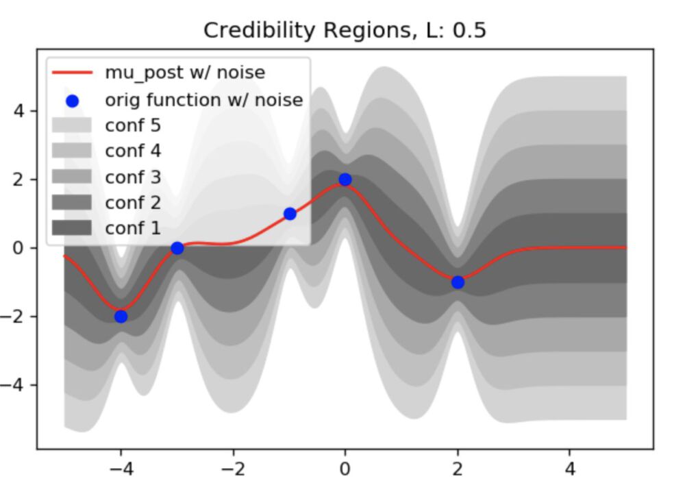
What is the difference in comparison to the previous plot ? What is the interpretation ?
Now that noise is introcuded into the dataset, there is no way to perfectly fit the prediction to the input vector. previously, the ambiguity was only between the points and not at the points themselves. With the noise, the curves dont perfectly converge around the points anymore. The crests and troughs of the curves do not perfectly align with the points anymore, which leads to the ambiguity.
Therefore, the models will be much less accurate. With enough drawn samples, the final distribution of the confidence zones will still give a usable model.
(g)
for l in [0.001,0.1,0.5,1,2,10]:
    k1_noise_2 = k(x1_v,x1_v,l,1) # x*, x*
    k2_noise_2 = k(x1,x1_v,l,1)   # x , x*
    k3_noise_2 = k(x1,x1,l,1) + 0.1*np.eye(len(x1))    # x , x + noise


    # same as above to caculate posterior mean and covariance
    mu_post_noise_2 = (k2_noise_2.T@np.linalg.inv(k3_noise_2))@f
    K_post_noise_2 = k1_noise_2 - k2_noise_2.T@np.linalg.inv(k3_noise_2)@k2_noise_2

    # sampe as above to draw samples
    samples_noise_2 = draw_samples(mu_post_noise_2,K_post_noise_2,25)

    # same as above to plot samples
    figure(figsize=(6, 4), dpi=120)
    plt.plot(x1_v,samples_noise_2,color="lightgray")
    plt.plot(x1_v,mu_post_noise_2,color="blue",lw=3,label="mu_post w/ noise")
    plt.scatter(x1,f,color="orange",label="original function w/ noise",lw=3,zorder=100)
    plt.legend()
    plt.title("Drawn Samples and mu_post, L: "+str(l))
    plt.show()

    # plot Credibility Regions
    figure(figsize=(6, 4), dpi=120)
    plt.plot(x1_v,mu_post_noise_2,color="red",zorder=99,label="mu_post w/ noise")
    plt.scatter(x1,f,color="blue",zorder=100,label="orig function w/ noise")
    for conf,color in zip([5,4,3,2,1],["lightgray","silver","darkgray","gray","dimgray"]):
        plt.fill_between(x1_v ,mu_post_noise_2 + cred_reg(K_post_noise_2,conf),mu_post_noise_2 - cred_reg(K_post_noise_2,conf),color=color,label="conf "+str(conf))
    plt.title("Credibility Regions, L: "+str(l))
    plt.legend(loc="upper left")
    plt.show()


(h)
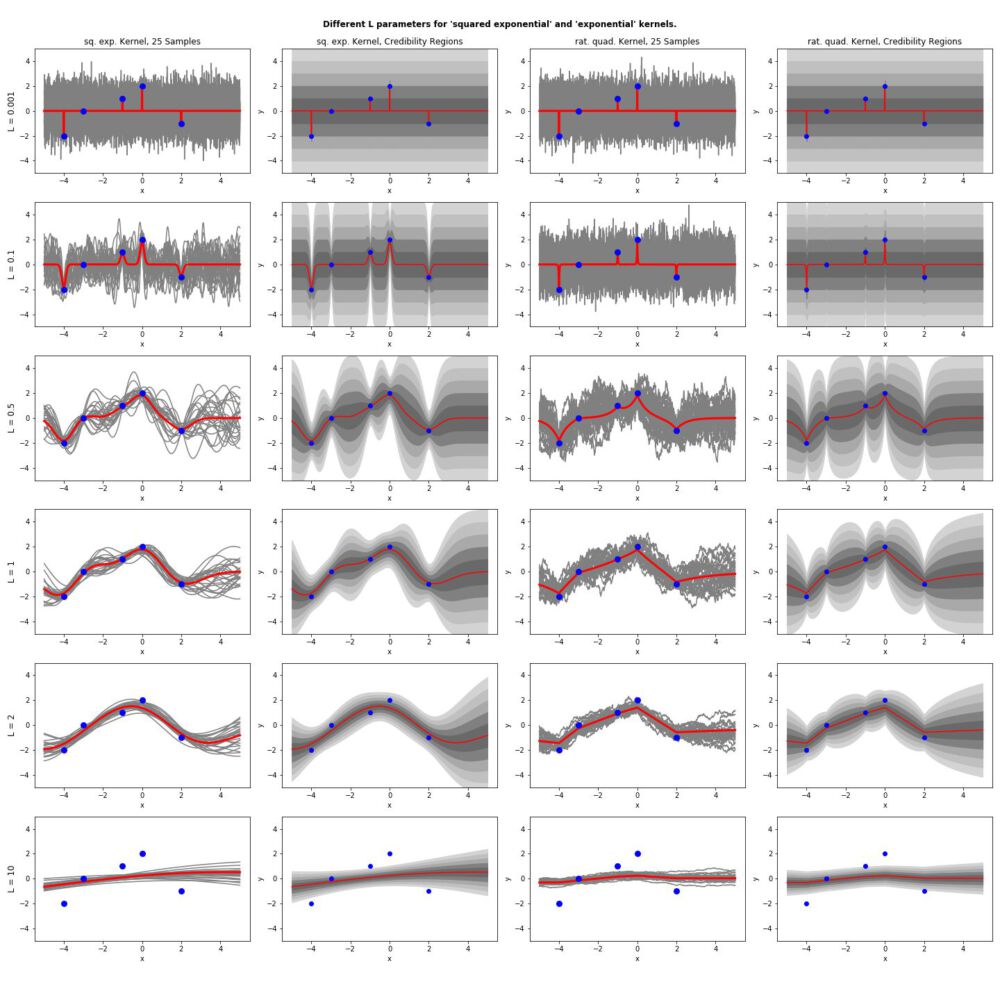
Clean up and print final results orderly
def create_viz():

    # create plot structure
    fig, ax = plt.subplots(6, 4,figsize=(20,20))
    fig.suptitle("Different L parameters for 'squared exponential' and 'exponential' kernels.",size='large',fontweight='bold')
    for a in ax.flat:
        a.set(xlabel='x', ylabel='y')
        a.set_ylim(-5,5)

    cols = ['sq. exp. Kernel, 25 Samples','sq. exp. Kernel, Credibility Regions','rat. quad. Kernel, 25 Samples','rat. quad. Kernel, Credibility Regions']
    rows = ["L = 0.001","L = 0.1","L = 0.5","L = 1","L = 2","L = 10"]

    #fig, axes = plt.subplots(nrows=4, ncols=3, figsize=(12, 8))

    for a, col in zip(ax[0], cols):
        a.set_title(col)

    for a, row in zip(ax[:,0], rows):
        a.set_ylabel(row, rotation=90, size='large')


    # normal
    for count,l in enumerate([0.001,0.1,0.5,1,2,10]):
        k1_tmp = k(x1_v,x1_v,l,1) # x*, x*
        k2_tmp = k(x1,x1_v,l,1)   # x , x*
        k3_tmp = k(x1,x1,l,1) + 0.1*np.eye(len(x1))    # x , x + noise


        # same as above to caculate posterior mean and covariance
        mu_post_tmp = (k2_tmp.T@np.linalg.inv(k3_tmp))@f
        K_post_tmp = k1_tmp - k2_tmp.T@np.linalg.inv(k3_tmp)@k2_tmp

        # sampe as above to draw samples
        samples_tmp = draw_samples(mu_post_tmp,K_post_tmp,25)

        # same as above to plot samples
        #figure(figsize=(6, 4), dpi=120)
        ax[count,0].plot(x1_v,samples_tmp,color="gray")
        ax[count,0].plot(x1_v,mu_post_tmp,color="red",lw=3,label="mu_post w/ noise")
        ax[count,0].scatter(x1,f,color="blue",label="original function w/ noise",lw=3,zorder=100)
        #ax.legend()
        #ax[count,0].set_title("Drawn Samples and mu_post, L: "+str(l))
        #plt.show()

        # plot Credibility Regions
        #figure(figsize=(6, 4), dpi=120)
        ax[count,1].plot(x1_v,mu_post_tmp,color="red",zorder=99,label="mu_post w/ noise")
        ax[count,1].scatter(x1,f,color="blue",zorder=100,label="orig function w/ noise")
        for conf,color in zip([5,4,3,2,1],["lightgray","silver","darkgray","gray","dimgray"]):
            ax[count,1].fill_between(x1_v ,mu_post_tmp + cred_reg(K_post_tmp,conf),mu_post_tmp - cred_reg(K_post_tmp,conf),color=color,label="conf "+str(conf))
        #ax[count,1].set_title("Credibility Regions, L: "+str(l))
        #plt.legend(loc="upper left")
        #plt.show()


    # kernel
    for count,l in enumerate([0.001,0.1,0.5,1,2,10]):
        k1_tmp = k_kernel(x1_v,x1_v,l,1) # x*, x*
        k2_tmp = k_kernel(x1,x1_v,l,1)   # x , x*
        k3_tmp = k_kernel(x1,x1,l,1) + 0.1*np.eye(len(x1))    # x , x + noise


        # same as above to caculate posterior mean and covariance
        mu_post_tmp = (k2_tmp.T@np.linalg.inv(k3_tmp))@f
        K_post_tmp = k1_tmp - k2_tmp.T@np.linalg.inv(k3_tmp)@k2_tmp

        # sampe as above to draw samples
        samples_tmp = draw_samples(mu_post_tmp,K_post_tmp,25)

        # same as above to plot samples
        #figure(figsize=(6, 4), dpi=120)
        ax[count,2].plot(x1_v,samples_tmp,color="gray")
        ax[count,2].plot(x1_v,mu_post_tmp,color="red",lw=3,label="mu_post w/ noise")
        ax[count,2].scatter(x1,f,color="blue",label="original function w/ noise",lw=3,zorder=100)
        #plt.legend()
        #ax[count,2].set_title("Kernel Trick: Drawn Samples and mu_post, L: "+str(l))
        #plt.show()

        # plot Credibility Regions
        #figure(figsize=(6, 4), dpi=120)
        ax[count,3].plot(x1_v,mu_post_tmp,color="red",zorder=99,label="mu_post w/ noise")
        ax[count,3].scatter(x1,f,color="blue",zorder=100,label="orig function w/ noise")
        for conf,color in zip([5,4,3,2,1],["lightgray","silver","darkgray","gray","dimgray"]):
            ax[count,3].fill_between(x1_v ,mu_post_tmp + cred_reg(K_post_tmp,conf),mu_post_tmp - cred_reg(K_post_tmp,conf),color=color,label="conf "+str(conf))
        #ax[count,3].set_title("Kernel Trick: Credibility Regions, L: "+str(l))
        #ax.legend(loc="upper left")
        #ax.show()
    plt.tight_layout(rect=[0, 0.03, 1, 0.97])
    plt.savefig("out_gaussian_hw.png")

create_viz()