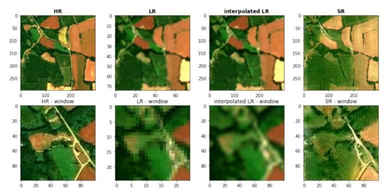
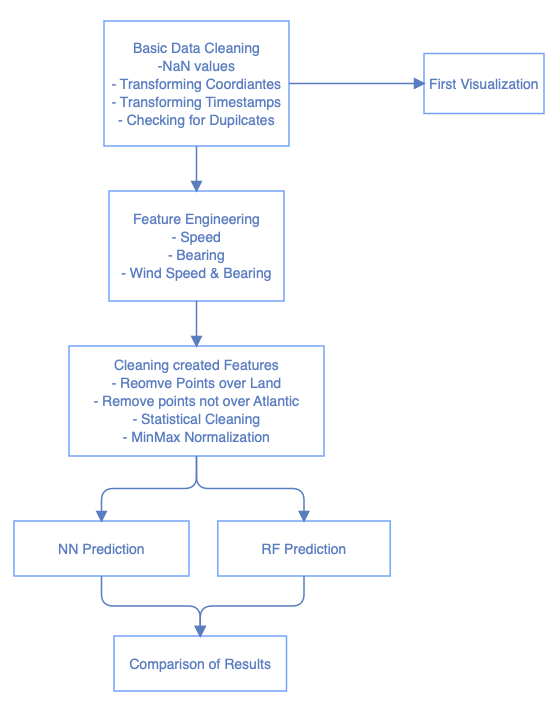
2. Workflow
The following flowchart gives a general overview of the steps performed in the worflow.
3. Basic Data Cleaning
At first, the dataset is examined for its properties and style. Also, first cleaning measures are taken.
3.1 General CSV overview
Looking at the .info() output of the Pandas DataFrame, the total amount of data points is shown as well as the column names and their individual data types.
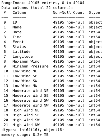
About 49,100 rows are present, with information on the position, wind speeds, pressure, timestamps and certain event types such as the first landfall of a hurricane.
Importantly, we see that the timestamp is given as an integer and will therefore have to be transformed to a proper time data type, same for the longitude and latitude info.
3.2 Formatting NaN Values
As mentioned in the documentation, non-existing values of the wind information is represented as -999 and -99 values, which have to be replaced since they would otherwise negatively affect the statistics and prediction.
3.3 Transforming Coordinates
The coordinates are present as strings with a “N”/”S” or “E”/”W” attached at the end. These are now transformed into numerical values by removing the last character and turning the number negative if they are pointing to a coordinate on the Eastern or Southern hemispheres.
3.4 Transforming Timestamps
Since the timestamps are given as integers, they are transformed into a proper format using the DateTime library. This allows for quick and easy calculation of differences in timestamps.
3.5 Checking for Duplicates
The dataset is checked for duplicate rows, but none are found.
4. Data Overview
4.1 Gain basic understanding of Data
Now that the first basic data cleaning has been done, the values are examined for their suitability for the prediction.
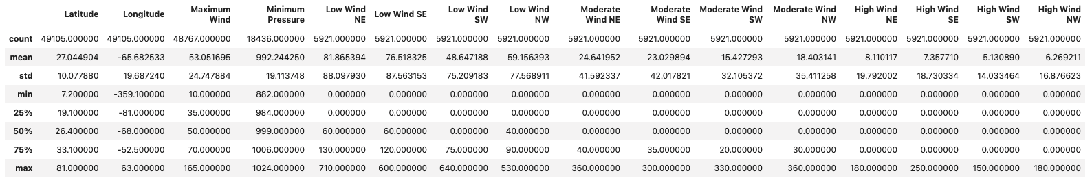
After cross-referencing the “Status” and “Event” columns with the data description, it is clear that they do not have relevance to the speed and bearing prediction that is performed later. The numerical values can potentially be of importance, so some features will be extracted from them later. A look at the statistical distributions of the numerical columns is created via the pandas.describe() function.
Examining the unique IDs of the hurricanes, it is calculated that there are a total number of 1814 hurricanes with an average of about 27 hurricanes per year, ranging from the year 1851 until 2015.
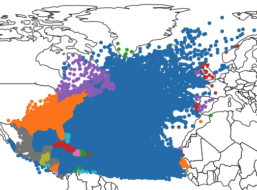
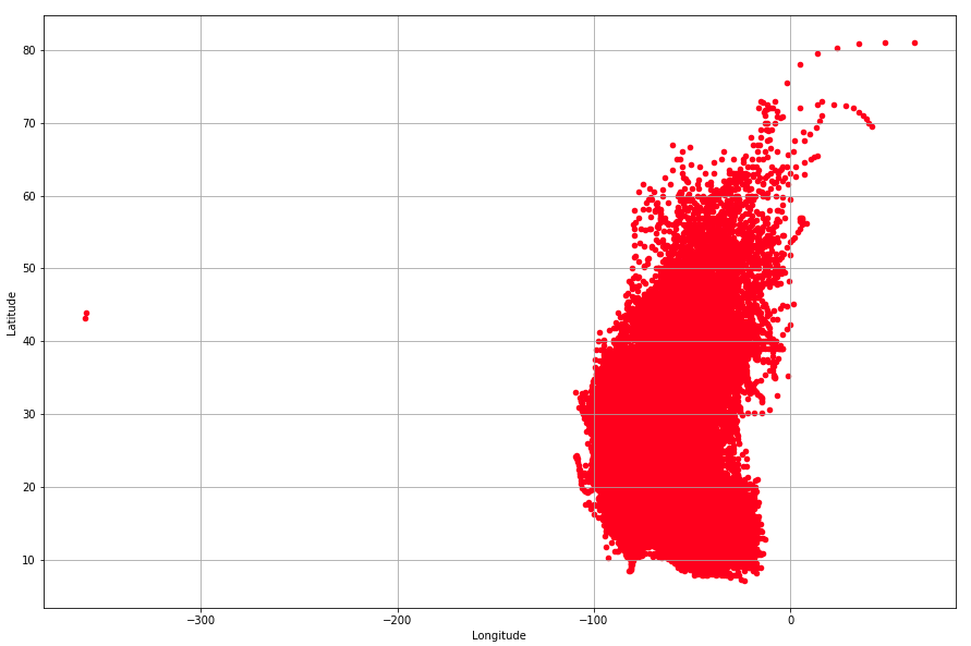
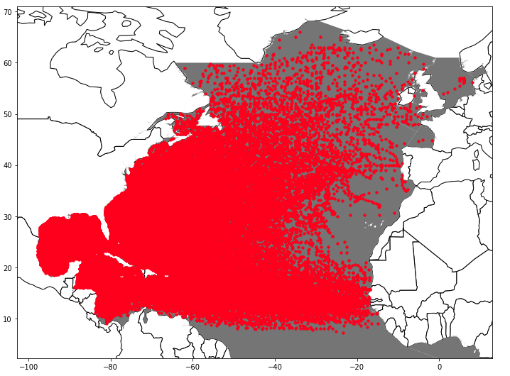
To check the coordinates, a first plot of the latitude and longitude is created to spot any obvious outliers. Note that this plot is not geograhically projected.
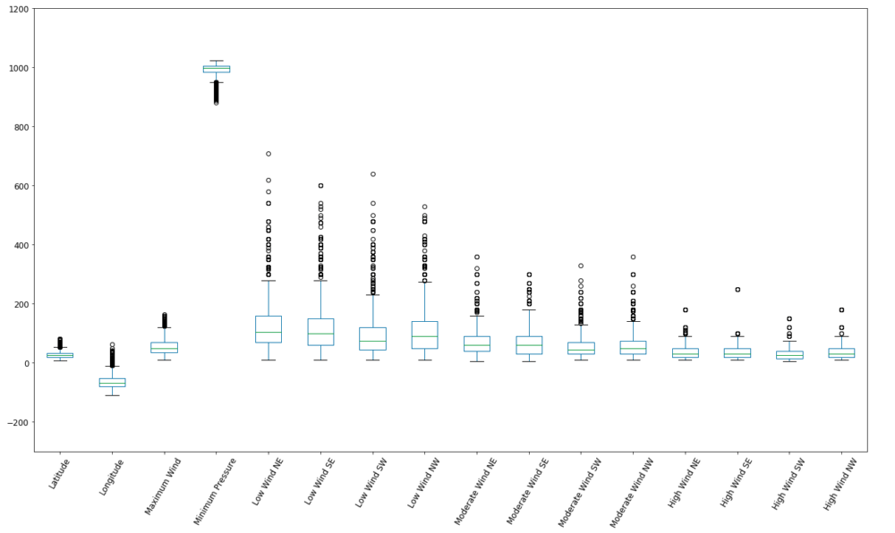
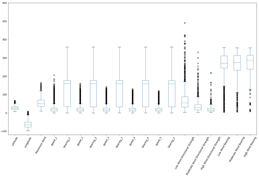
Also, a boxplot can give a good overview of the distribution and outliers of the numerical information of the dataset.
4.2 Plot Hurricanes by Year
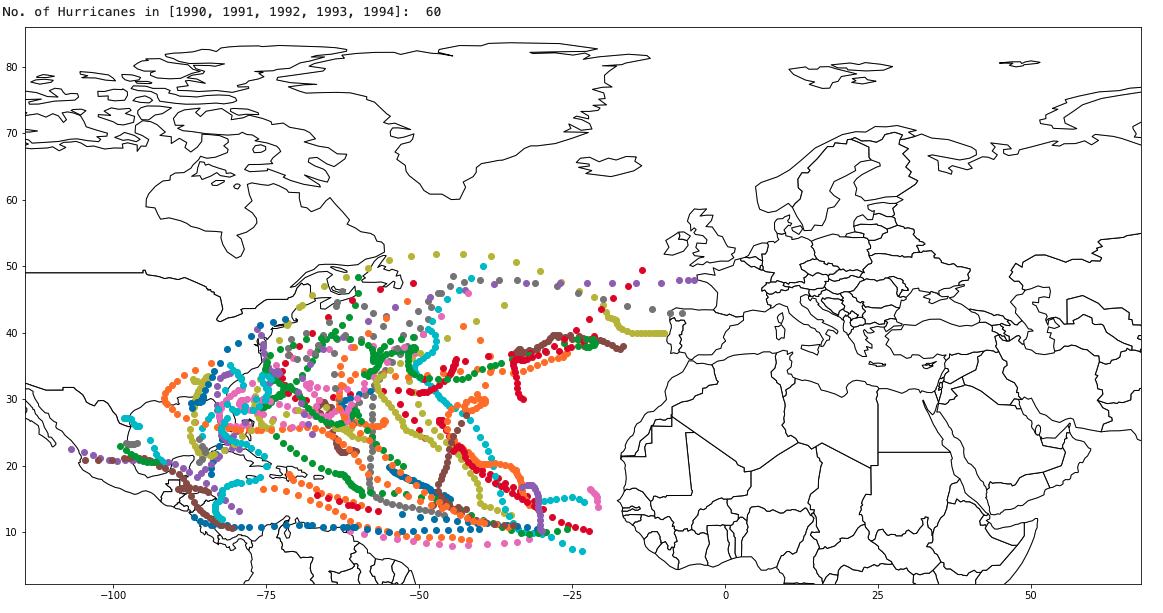
To get a spatial perspective of the hurricanes, a few selected years are now plotted and the data points color-coded by hurricane.
5. Feature Engineering
After the dataset was examined, now the features are created that will be used to predict the speed and bearing.
5.1 Calculate Speed and Bearing to previous data point/s
The most important information of course is the past speed and bearing. Therefore, for each data point, the previous 5 data points back in time are taken into account and the average speed and bearing calculated. This should give the best predictor for speed and bearing, since the future speed and bearing are most likely to be closely causally related to the next ones.
5.2 Low/Moderate/High Wind Average Heading and Strength
For some of the datapoints, the low, moderate and high altitude wind speed and bearing are given. unfortunately, they are split into NW, SW, SE and NE columns. Therefore, for both wind and speed, the values are considered vectors, potentially cancelling each other out but resulting in an overall direction and speed in a certain direction.
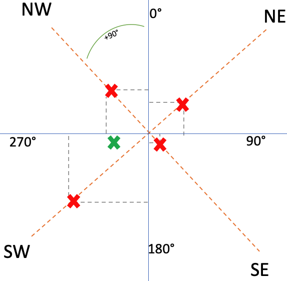
In schema 6, the red points represent the strength of the weed to the given directions. The green coordinate is the overall direction (angle to the graph origin) and strength (distance from origin). The point is calculated by the following formula:
- x coordinate = ( (SW+SE)/2 ) – ( (NW+NE)/2 )
- y coordinate = ( (NW+SW)/2 ) – ( (NE+SE)/2 )
- distance from point to origin: sqrt( ((x2-x1)^2) + ((y2-y1)^2) )
5.3 Cleaning of Created Features
Before looking at the values created features, it is important to now that hurricanes are severely influenced by the temperature of the water and wether they are over land (where they can grow) or over land (where they die out). Therefore, the points over land are removed first and then the points which are not over the Atlantic ocean.
After that, the features are statistically cleaned by removing outliers.
5.3.1 Removal of data points on Land
Using the “world” layer included in the geopandas package, a spatial join of the country polygons and the data points is performed. Those points that received a ISO country code are then removed.
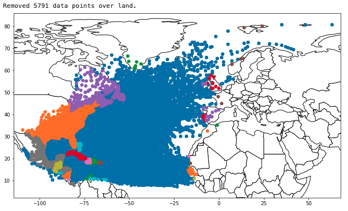
What is visible here as well is that some data points are in the Atlantic Ocean and others even in the Arctic Ocean.
5.3.2 Removal of Data Points outside of the Atlantic Ocean
The above mentioned datapoints in different oceans and therefore climates, temperatures and ocean currents might introduce a considerable noise into the dataset, since they behave differently and therefore make training and prediciton less accurate.
in order to remove these points, a Shapefile (CC-BY) from the International Hydrographic Organization is loaded into geopandas and a spatial join performed with the dataset. The shapefile represents the internationally recognized area of the Atlantic Ocean.
Of course the previous masking of the land masses is not necessary since they are masked to the Atlantic Ocean later anyways, but the previous step is also included, because while performing certain tasks other ideas can come up.
5.3.3 Statistical Cleaning of created Features
With the features now created, the distribution of those features is examined in order to determine if the calculations worked and the resulting values make sense.
The created and now masked features are statistically cleaned, removing the outliers for wind strength and speed. Removing bearing outliers for both movement and wind is nonsensical. For both wind speed and movement speed, if the observed value has a z-factor of over 3 or under -3, it is removed and changed to np.NaN.
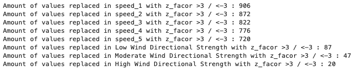
Another important thing to keep in mind is that the ML techniques used can not handle NaN values. This is not a big issue, since the previous 5 data points of each individual data points are needed to perform a prediction anyway. Therefore, those rows that have NaN values anywhere in their features (= always the first 5 data points per hurricane) are removed from the dataset. 10,907 rows are eliminated, leaving a total of 32,016 data points for training the ML predictors.
5.3.4 Normalization – MinMax Scaling
Since it is intended to use a Neural Network, the data is normalized. this method in particular requires a normalization, in this case the MinMax scaler is used in order to project all values to a range from 0 to 1. The scaled dataframe is saved separately, since the Random Forest does not require normalization.
5.4 Correlation of created Features
Now, a look is taken at the statistics for the newly created values, as well as the statistical correlations for each data point against each other data point.
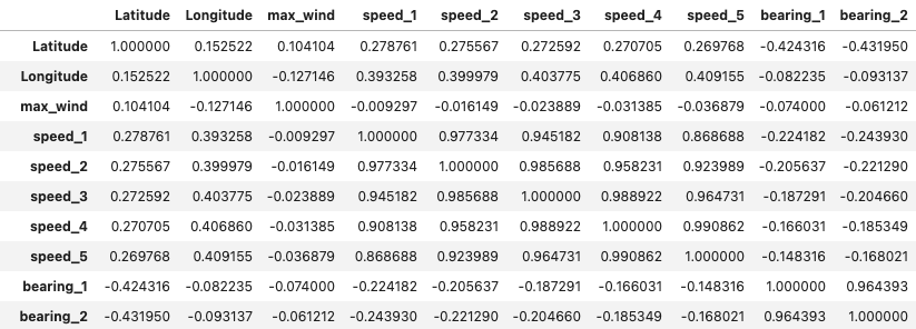
Clearly, the correlation between previous speed and bearing and their according present values (speed_1 and bearing_1) is very high, mostly in the high 0.8 – 0.9 value range. It also makes sense that farther removed points in time (speed_4, speed_5) have a lower correlation than the more recent ones (speed_2, speed_3). This promises a good prediction result, since correlation between those values is the basis for an accurate prediction result.
The correlation between all of the wind speed and bearing altitude zone values is quite low (mostly around 0.2), therefore this information will unfortunately not be useful for the prediction.
Based on the engineered features and their correlation values, all previous speed and bearing data points will be used as inputs for the ML training.
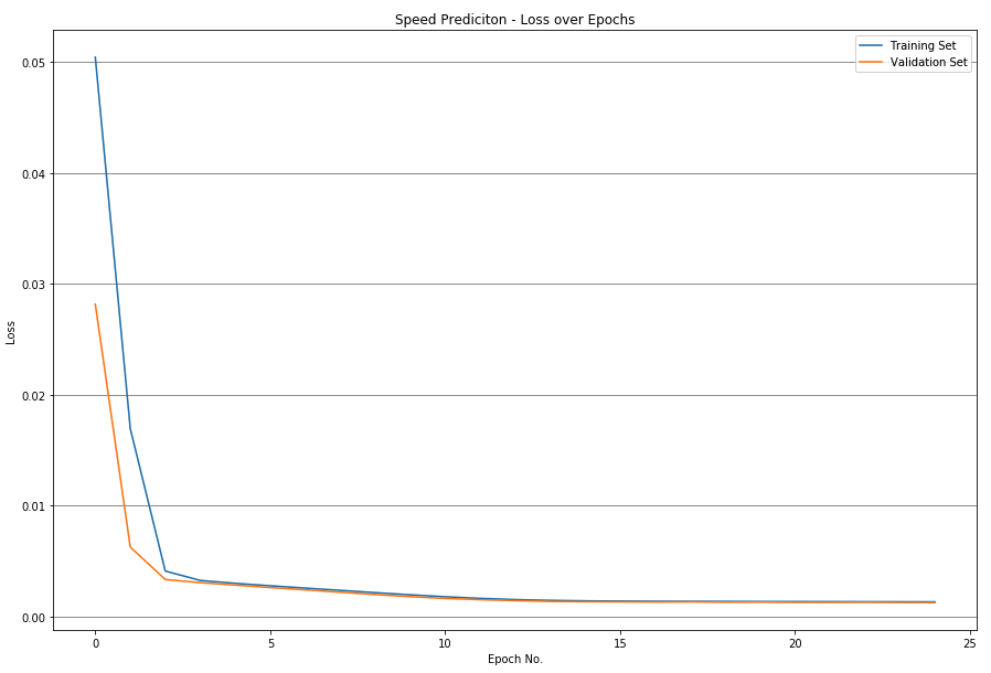
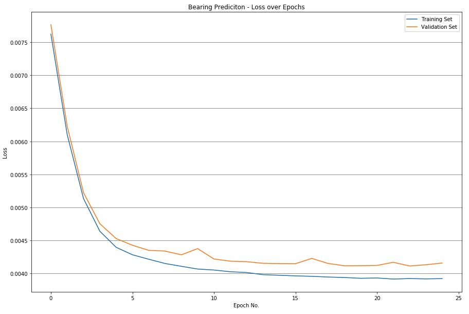
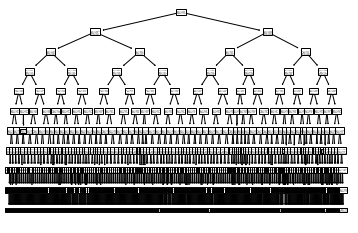
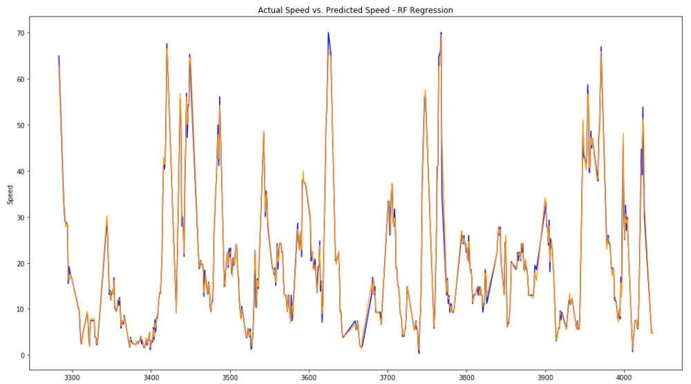
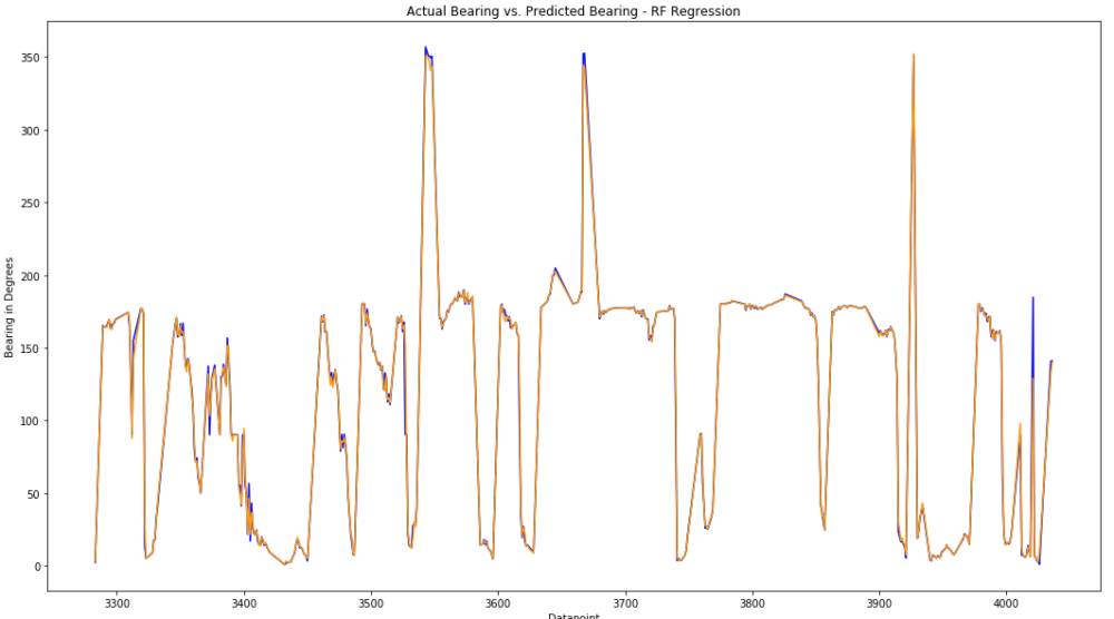
6.3 RF Speed and Bearing Prediction
As a second ML technique, the Random Forest Regressor is now used to predict the speed and bearing values. Since the RF Regressor does not perform better with normalized values (or different features that have been brought to the same scale), the absolute values are fed into the training of the decision trees. 15% of the data points are used to access the accuracy, while 85% are used to train the estimators.
The forest consists of 200 estimators (decision trees), set to a maximum depth of 10. If the max. depth is not limited, decision trees up to 35 nodes deep are created, but that does not positively affect the accuracy. Therefore, the depth was limited to 10 in order to improve performance.
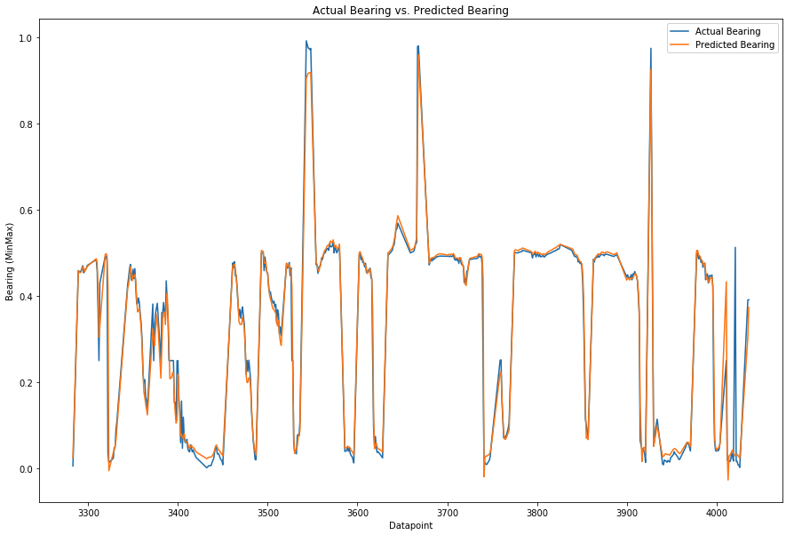
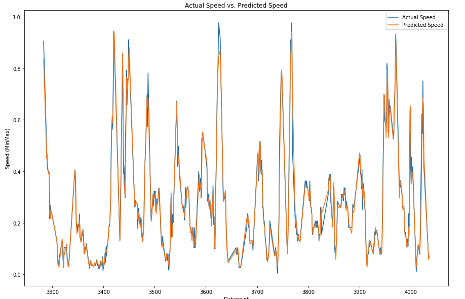
7. Comparison and Conclusion
After having performed the training and prediction as well as a first accuracy assessment of the two techniques, they are now compared to each other. To achieve this, the coefficient of determination (R squared) is calculated for all of the predictions.
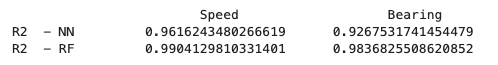
Both techniques are more accurate for the speed prediction than the bearing, but generally have a very small error. In comparison, the RF Regressor produces significantly better results, even though both techniques performed well. Most likely, the main factor that enabled such high-quality results was the masking of the hurricanes to the Atlantic Ocean as well as the removal of outliers.
Since the RF is easier and faster to train, does not suffer from a risk of neuron death, does not require the extra step of normalization, and produces better results; the RF Regressor the superior technique for this application.