Surface Runoff Analysis

Introduction

In this blog post, we focus again on the Neubach catchment area on the south-western side of the Dachstein massif, which was already analysed regarding its slope and curvature in the terrain analysis lab.

A workflow is followed, which returns the following results:

  • the filled DEM
  • the flow direction model
  • the delineated watershed area
  • the flow accumulation layer
  • a hydrograph
All of the workflow is built within the ArcGIS Pro Model builder, which includes 8 different tools in order to automate the analysis. Only the DEM and the pour point of the catchment area in question are the inputs, the rest is done automatically.
 
Also, those streams/cells that carry certain percentages of the total rainfall are identified.
 
Lastly, a small experiment is done in order to show the importance of the fill step in the workflow, where the flow accumulation result is displayed without the previous filling.
Image 1: ArcGIS Pro Model Builder, showing the workflow in this analysis. The inputs are blue, which are the DEM and a csv containing the pour point. Tools that are executed are yellow, while resulting layers are green.


All steps performed in the diagram above are retraced and investigated.


Model Builder Workflow

1. Fill

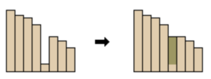
Firstly, the DEM is altered using the Fill tool in order to eliminate sinks. A sink is identified by its depth, which is the main parameter we change within the fill tool. Sinks which are under the threshold depth are filled within the DEM, which eliminates the hypothetical creation of small “lakes” in our study area, which are most likely due to DEM inaccuracies because of the resolution.

Image 2: ArcGIS Pro Fill Tool, image taken from the ArcGIS documentation. This represents a profile through a DEM, the depth of the sink is the difference in elevation of the pixel in question vs. it’s hypothetical pour point. If the sink is lower than out threshold, it is filled by the algorithm.

2. Flow Direction

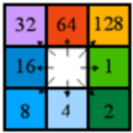
Next up, the flow direction is calculated. For each cell in a raster, the closest cell with the lowest value is chosen as the flow direction. The D8 algorithm, which is named this way because the direction of flow can go to any of the 8 cell neighbors, choses the steepest decline in elevation for each cell, also taking the distance to the cells into account. A diagonal cell for example of course is aprox. 1.4 times further than a direct neighbor. Each cell is then encoded with the direction of flow, see figure number 3.

Image 3: From the cell in question, the direction is encoded numerically by the shown schema. The image is taken from the official ArcGIS documentation.
Image 4: Visualization of flow direction. Each color represents one of the 8 flow directions, but the visualization is not important yet. Nonetheless, drainage divide lines are already visible.

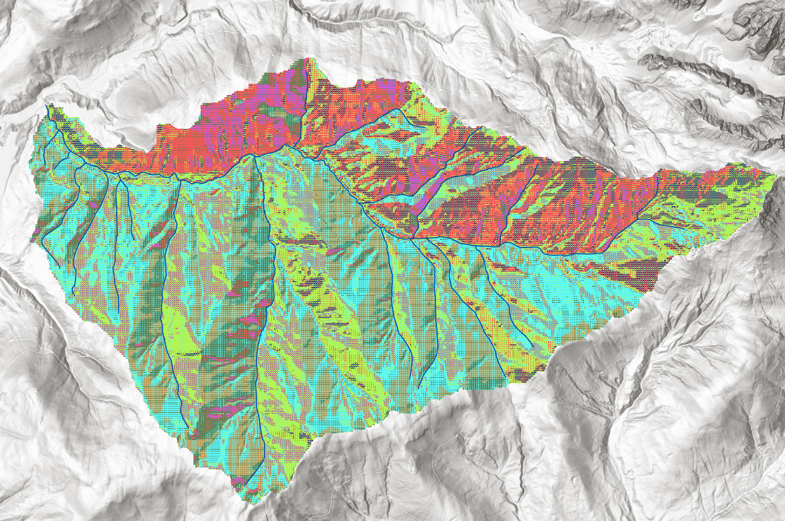
3. Watershed (and import of pour point)

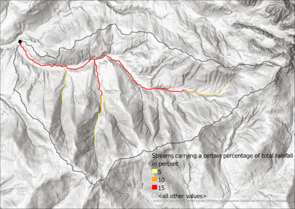
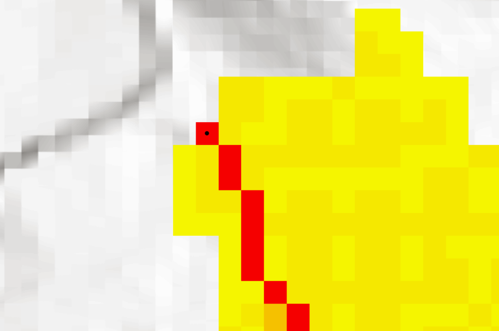
After calculating the flow direction, we delineate watershed areas. In order to create the watershed, we need to identify the lowest point and therefore pouring point of the Neubach, which is of course located where the Neubach drains into the Salzach. Please note that in this ArcGIS Model, it is assumed that the pour point is already known. If that is not the case, the flow accumulation needs to be executed first and the lowest point of the watershed area identified, before the watershed can be created. Image 5 shows the selection of the pour point. For the sake of clarity, this model assumes that the point is known already so that the area can be masked before the other outputs are created. Also, the results will need to be clipped later anyway in order to produce clean Histograms and other analysis, so it is more efficient to mask the input raster on which the following steps are based on than to mask the multiple results later on.

Image 5: Flow accumulation result. The flow accumulation shows how many cells drain into each cell, the visualizaiton here ranges from yellow (less drainiage) to red (more drainage). The highest value pixel is logically the flows end point, where it drains out of our area. This point is chosen as the pour point for our further analysis.

This model imports a .csv file which contains the coordinates of the manually selected pour point. The watershed function in ArcGIS Pro did not accept a manually drawn point as input, so the workaround with the csv creation had to be taken. 

Manually defining the exact pixel which will serve as the pour point also eliminates the need for the “Snap Pour Point” tool. This tool would move the pour point to the highest accummulated flow cell within a certain distance, but is not used in this case because we are certain to have chosen the right spot and do not want the tool to move the point towards the Salzach river, which would completely ruin the workflow.

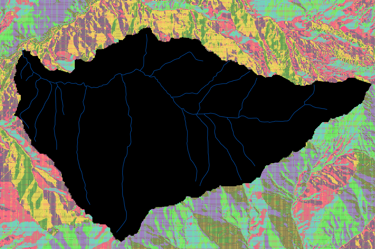
The watershed tool returns a raster which contains all pixels that drain into the pour point, based on the D8 flow direction raster and the given pour point. By tracing the flow directions, the tool “crawl up” from each cell. When the tool can not climb higher in any direction because the terrain is falling again, it stops and returns the watershed area.

Image 6: Drainage area, as returned by the watershed tool. In the background, the flow direction layer is still visible. The output is just a raster which shows the drainage area. The blue lines are the rivers as providwed by the Salzburg Rivers layer, which were included to give a rough interpretation of the terrain and as a quality assessment for the streams that will be extracted from the DEM in the following steps.

4. Converting the watershed raster to a polygon and masking the flow direction to the watershed

Since now the watershed area is known,   this layer is vectoriued in order to save the limits of the dataset. Also, because the following steps will be based on the flow direction raster, it is masked by the extent of the watershed and saved in order to speed up processing and clear up the visualization.

Image 7: Visualization of flow direction masked by the watershed extent. In the background, a hillshade based on the 10m DEM is rendered. The blue lines are the rivers as providwed by the Salzburg Rivers layer, which were included to give a rough interpretation of the terrain and as a quality assessment for the streams that will be extracted from the DEM in the following steps.

5. Flow accumulation

The flow accumulation was already introduced earlier in the extract on how to find the pouring point of a given area, but now the model performs the flow accumulation analysis automatically based on the masked flow direction layer. The flow direction analyses each cell and moves “upward” based on the flow direction layer, counting how many cells drain into the cell in question. Therefore, each cell contains the number of how many cells drain into it. This layer is a bit hard to visualize because most cells only have a handfull of “upward” cells, but the number grows quickly the further down the catchment area we go. The median number of cells which drain into each cell is 2. Since all cells of the watershed drain into the pour point, the pour point has a flow accumulation value of the total amount of cells in the raster (minus one, itself).

Image 8: Flow accumulation visualization. Yellow areas show that ony a handfull of cells drain into those cells, while red show high numbers up until the amount of 429.220 at  the pour point. Since the red lines show accummulations of runoff, they can already be considered as representations of streams in the catchment area.
Image 8: Flow accumulation visualization. Yellow areas show that ony a handfull of cells drain into those cells, while red show high numbers up until the amount of 429.220 at the pour point. Since the red lines show accummulations of runoff, they can already be considered as representations of streams in the catchment area.

6. Flow Length

Next up, again again based on the masked flow direction raster, the flow length is calculated. The flow length measures the length along the path of flow from each cell to the pour point in meters. By classifying the distance, areas of equi-distance from the pour-point can be calculated, see image 9.

The information can also be used to create a Histogram (graph 1). The histogram shows the frequency of flowing distance binned in 20 bins.

Image 9: Visualization of equi-distance areas, based on flow-length raster. Classified in 10 classes of the same size.

The histogram offers much more interesing insights than just the distribution of distances from the pour point. If we assume that the distance is equivalent to the time it takes the water to travel that distance, we can gain some knowledge into the strength of the flow at certain times. 

Let’s imagine a rainfall, where an amount of water is precipitated equally over the watershed in question. Since we can translate the distance from the pour point directly to the time it takes to arrive at said point, and the amount of cells is directly proportional to the amount of water, the histogram displays the same curve that a flow-meter at the pour point would display. The peak flow at that point might be a challenge to the infrastructure, leading to higher erosion and the danger of flooding. Lowering the histogram peak would lead to a reduction in peak flow, therefore we can identify the areas of the peak flow creation and advise not to cut down trees, take off topsoil or otherwise reduce the water-storing capacity of that area.

Taking two of the bisn from Graph 1 with the highest peaks (distance from 9.087-10601m) gives us the following area, which should be especially protected.

Image 10: The two peak bins from Graph 1 (9.087-10.601m distance from pouring point), area visualized. Special protection should be afforded to those areas, since the precipation of a large area arrives at the pour point within a small timeframe. The black line delineates the catchment area.

Identification of streams that carry certain percentages of the total precipation in the catchment area

In order to find those locations that carry at least 15% of the whole precipation of the catchment area, we first have to find out the total amount. Since the flow accumulation layer adds up all cells, the value of the pour point of this layeris the same as the total amount of cells and therefore amount of water (more exact: value + 1 for itself = 429.221). From this, the cells carrying certain percentages can be identified.

Running workflow without previous filling of DEM

Lastly, the model builder is run without the fill tool in order to see if the result is any different. After creating the flow direction layer, the flow accumulation layer is created and visualized.

Clearly, without the previous filling the streams just disappear at random at certain positions due to sinks where there is no “escape” from, leading to the scenario that not all cells sooner or later find their way to the pour point but instead disappear somewhere along the way. Of course this is not an accurate representation of reality, since even if a small sink would exist there, it would quickly fill, form a small “lake” and overflow, leading the water to reach the pour point. Most likely, the sinks in the dataset are not accurate but instead errors in the dataset.

Leave a Reply

Your email address will not be published. Required fields are marked *

Further Reading
Recent Updates